Dev Log: Design Choices, Unimplemented Tech, Original Art Goals
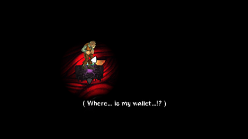
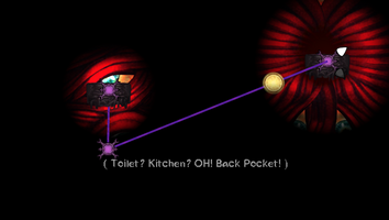
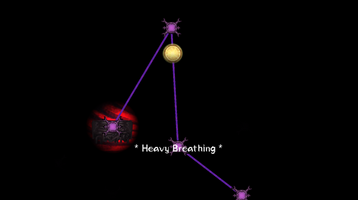
>SUMMARY:
The main goal for Passion Primer was to assess our teamwork of 3. We had an idea we wanted to create but it was our first time working on a project. Programmer 'Napmi' mentioned that there was a Game Jam coming along and Designer 'Sunbird' suggested that we all use the Game Jam as a double whammy: a test of teamwork & a place to prototype mechanics and art concept that we might use for our passion project.
Much like most game ideas, we over-scoped but this isn't our first rodeo. Proud to say that we managed to cut off some of the lesser important features, artwork, and ideas to accomplish this with 30mins to spare. We hope you enjoy the game.
We believe that this is definitely the best we could have done given the circumstances.
Without divulging too much information, all 3 of us happened to have personal life commitments and work life commitments that rendered each of us "useless" for 2-3 days.
-----------------------------------------------------------------------------
>LOGS:
DAY 1 - 3:
After the group decided on the pillar and theme, [Sunbird] designed the main core mechanics and part of the UX. [Napmi] and the Artist got to work, creating concepts and the prototype systems.
Near the end of day 3, there were some communication issues. Requirements were not clearly defined by [Sunbird], a meeting was called. After 1 hour, on top of clearing up on the miscommunication, a consensus between them was established to use more point form when noting down requirements instead of paragraph.
DAY 4 - 6:
Unsure what the artist wants his alias as but we'll call him [Catimus] for the time being.
[Catimus]' work is going smoothly, [Napmi] has the work cut out for him, [Sunbird] encounters the first problem.
Design side:
Gameplay and Core idea is there; but it was difficult to come up with the idea to tell a story or the issue in his mind at the time: Player Engagement.
We would have liked to have a prototype out and have our friends test it early but unfortunately that did not come to pass. There were too many missing pieces that even if there were play testers, the feedback would be not as valuable. Missing pieces were: player engagement, character purpose of being, system [Jump Scare] mechanic, and UI text that conveys a hint of what the character, Jim, was going through.
Thus, there were no play testers and the first sign of a game was on day 7.
DAY 7 - 10:
Things were going slower than expected, mostly due to the unforeseen commitments that each of us had to take up on specific days. If I recall correctly, [Napmi] had limited time on Day 7 & 8, [Catimus] - Day 8 or 9, [Sunbird] Day 8 & 9.
By day 8, we talked about what to cut off and what is still important and needed to show the game as designed (as closely as possible anyway).
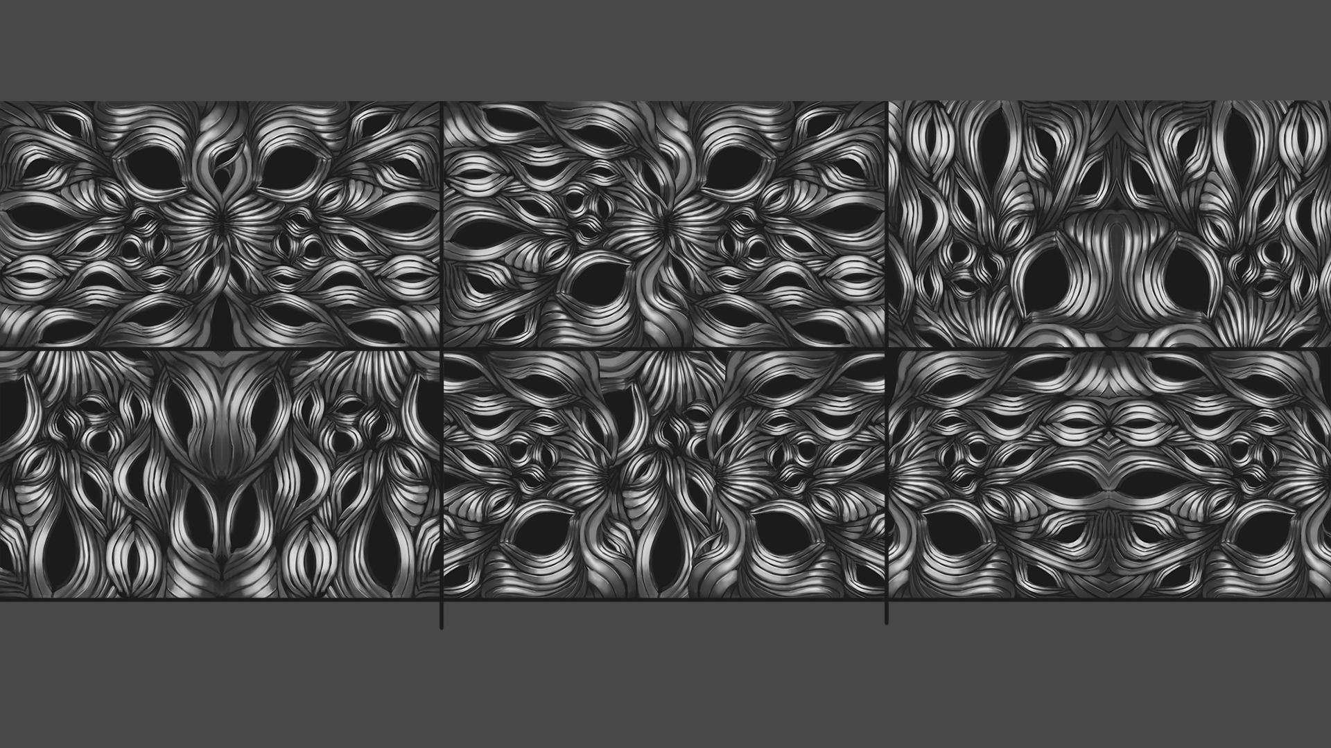
3 backgrounds >>> 1 Background with colour variants
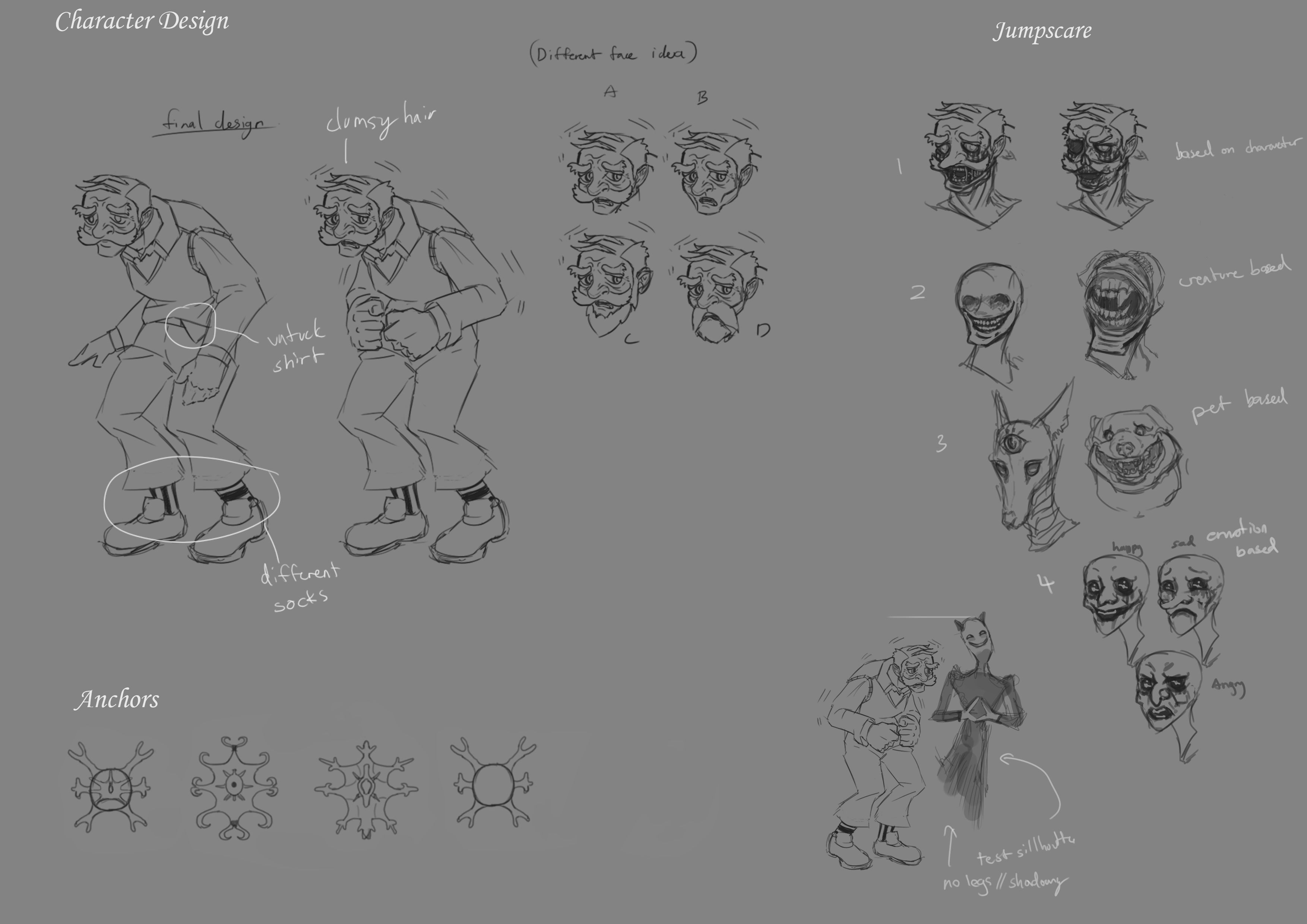
Assets and Animations >>> Cut most of the 'Jump Scares'
UI/UX >>> no time for the colours, screen shakes, VFX and UX effects that would help the experience.
15 Levels >>> 6 levels, 2 for tutorial (which is not enough)
-----------------------------------------------------------------------------
>LESSON LEARNT:
[Sunbird]:
The lesson I learnt is that audio really helps and is 1 of the possible tools to use to find a direction, I felt like we were in quite a pickle cause we only had gameplay but nothing else. Since the game happens inside Jim's head, randomly throwing out jump scares doesn't necessarily mean anything, the scope was too broad.
Imagine creating a Jump Scare using [traffic] elements and in the same level you get another event based on [airplane] elements, because it's an interpretation of anxiety, it doesn't need to make too much sense but the range is insane. You could say that I hit a point of anxiety while thinking about this issue.
After selecting some audio for the game and doing some foley based on what we had, inspiration struck and it was to use audio and text to convey some hint of what LIFE EVENT is going on OUTSIDE of Jim's mind. That gave a direction on how to design the levels and dress it with events, scares, and sound that fit the scenario.
On top of all that, thank you [Napmi] for teaching me more about the tools of Unity.
Last thing that I'm self-aware of is that I still tend to 'take on burden' that's not mine. I caught myself creating workarounds for [TECH] related issues because I believed that [Napmi] was having a little too much on his plate. [Catimus] told him what I wanted, it was fixed; I need to control that behaviour more.
[Napmi]: https://napmi.itch.io/
First off, I want to say good job to the team, as everyone stepped up on the last few days to get it through the line which was the most important thing.
What I Like
- We had separate roles to play in the team which was nice for a change. I only had to focus on the coding part while the other two focuses on the art and gameplay.
- Normally, I needed to drive myself and push myself to complete a game. But knowing I have teammates around is a driving force to keep going and had kept me accountable of the things I do.
- Someone to bounce off ideas and talk about the project itself.
- The game was pretty good when everything came together on the last few days.
However, to be honest it was not smooth operations entirely
Required many pieces
- Making the game was definitely challenging, as I believe it was difficult to imagine the game and to build it without a lot of pieces in play. It was really more of an experience to feel than an experience to play.
- There were many animations, functions, sounds, and UI that required one to complete before the other in specific sequences. I did my best in structuring this.
The team was tunneled vision in their tasks
- I believe this is truly the main reason how we had a lot of lost time and efforts.
- Tasks needed to be documented or written out, re-priotized
- The Scope needed to be re-scoped or measured as we reached the mid point
As a result of that,
- There was very minimal playtest
- There were game breaking bugs found on the last few hours before the jam
- Not enough polish on the animations, lightings, sounds
- Many many unused draft art which could had been better time spent.
What could be improve ?
- Faster prototypes to get a feel of things
- Sketches of the game itself or even a wireframe, ( this can go a long way )
- Planning out your time for the week and deadlines for your tasks
- Plan to finish earlier, as it will always take longer than what you initially envision.
- Building an early live build of the game so that it can be play tested easily and bugs could be found earlier
Overall, I believe this was a successful jam ! A game was released in it's full glory, and it only took us 10 days. Where many have joined the jam, only few have succeeded and we are one of them. So thanks to my teammates who given their commitment and time, as I have learned a lot from this experience.
[Catimus]:
-PENDING ENTRY-
-----------------------------------------------------------------------------
>WISHLIST:
Now, comes to the bit we wish to share (mostly [Sunbird]). What was originally intended but cut off due to time constraints and unforeseen commitments and circumstances.
- We did not manage to get the colour coding in to help in identifying the nodes. There are different nodes in game.
START node, CHECKPOINT node, ANXIETY node, GOAL node. -The GOAL node is the win condition. It is hidden and the player has to find the route(s) that reach it. -CHECKPOINT nodes will move Jim across the play area to the current node. -ANXIETY nodes send the player back to the start.
- Initial idea was to give Jim a colour and every other "NPC" their own colours as well.
Currently, this is how the game uses quotations and brackets to represent thoughts or dialogue.
-( ): Brackets are Jim's own thoughts.
-"": Double Quotations are NPCs talking to Jim. Player gets a hint of who that is based on the context of the text or based on what SFX/VFX was played.
-JIM:"" When Jim talks, his name will be shown explicitly.
- This is inside Jim's mind.
The final design idea was to go through a mind maze, while giving players a ton of space to imagine what's going on outside Jim's mind. What the players see in Jim's head is merely his own interpretation and how his anxiety possibly warps it.
The idea was executed to the best of what was available at hand. Unfortunately, without the first 2 [failed implementations], this idea falls flat, and flatter still without more extensive [TUTORIAL] levels.
- [Sunbird]: it's memory more than actual puzzle OR you can brute force all the paths. On top of that, unfortunately, our TARGETING control behavior was not what we expected. We only realized it at day 9 of 10. We are aware that the targeting feels quite erratic and gets in the way of progressing through memorized paths. This implementation of the targeting system further drops the quality of the game experience and we are deeply sorry for the inconveniences and frustrations.
- UX elements that we didn't have time to implement: Screen Shakes, Post-processing light warbles, more elegant wisp animation, colour coding of nodes, color coding of lines, targeting controls, targeting UI to contrast unexplored nodes, more extensive tutorial, simpler levels to get used to what the game is, a prelude/scene that properly sets up the premise of the set of stages.
- Obstacles: similar to [locked door] mechanics, Jim collects 'courage' to get pass a blocked area; timing related obstacles, an object that hits the wisp mid-travel and punishes the player; dialogue choices and more.
- Tools: Color nodes for easier memorizing; changing color path for 1 path; teleport and more.
>CONCLUSION:
Shortcomings aside, we are happy that we managed to finish this game. Our primary goal was believably - achieved.
At a basic and perhaps intermediate level: we worked well together; we give input and criticism when needed; we have yet to submit/give in to another when something isn't right. Everything looks good so far.
Even with all these issues in [Jim Jitters], it doesn't mean we've given up on the secondary goal - to get a win from this competition. Cross all our fingers and hope to fly!
Other:
Design:
Trello Board - https://trello.com/b/psx0FCwE/project-game-jam-june-2022
System: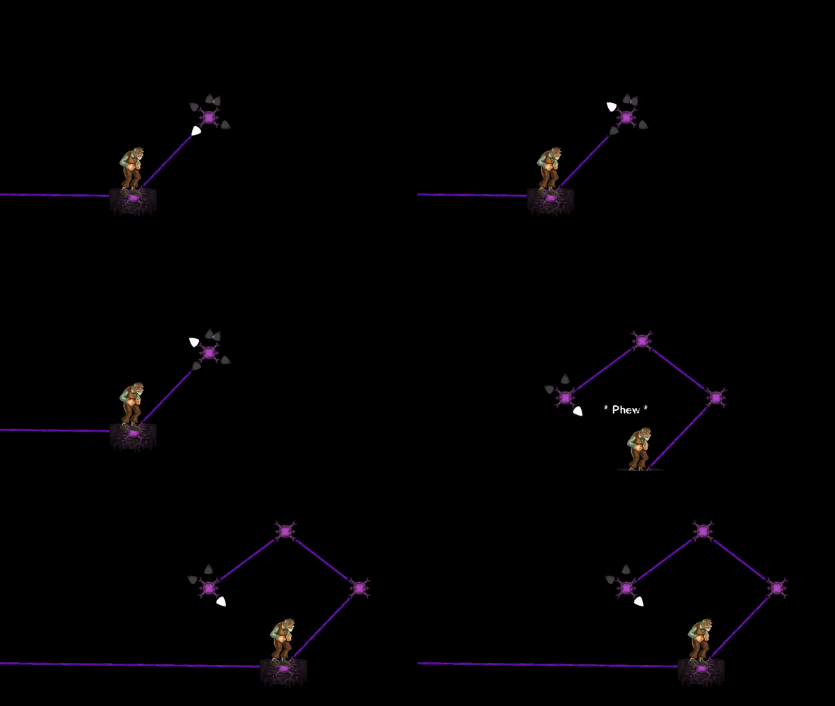
Final Ideation: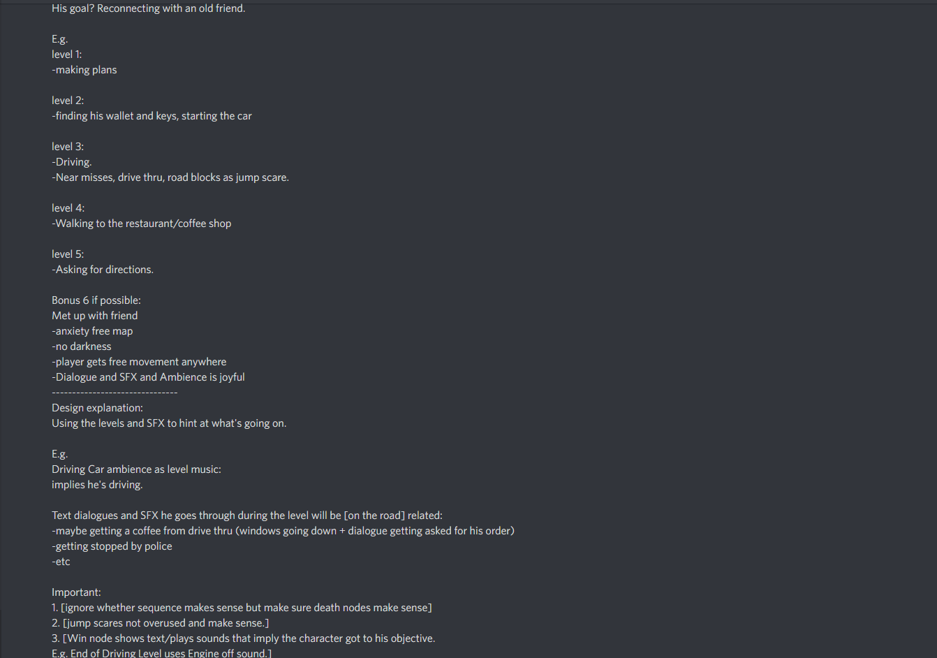
ART:
Jumpscare Animation -https://gyazo.com/332ad25c7fd0ead1c744c3aaef910802
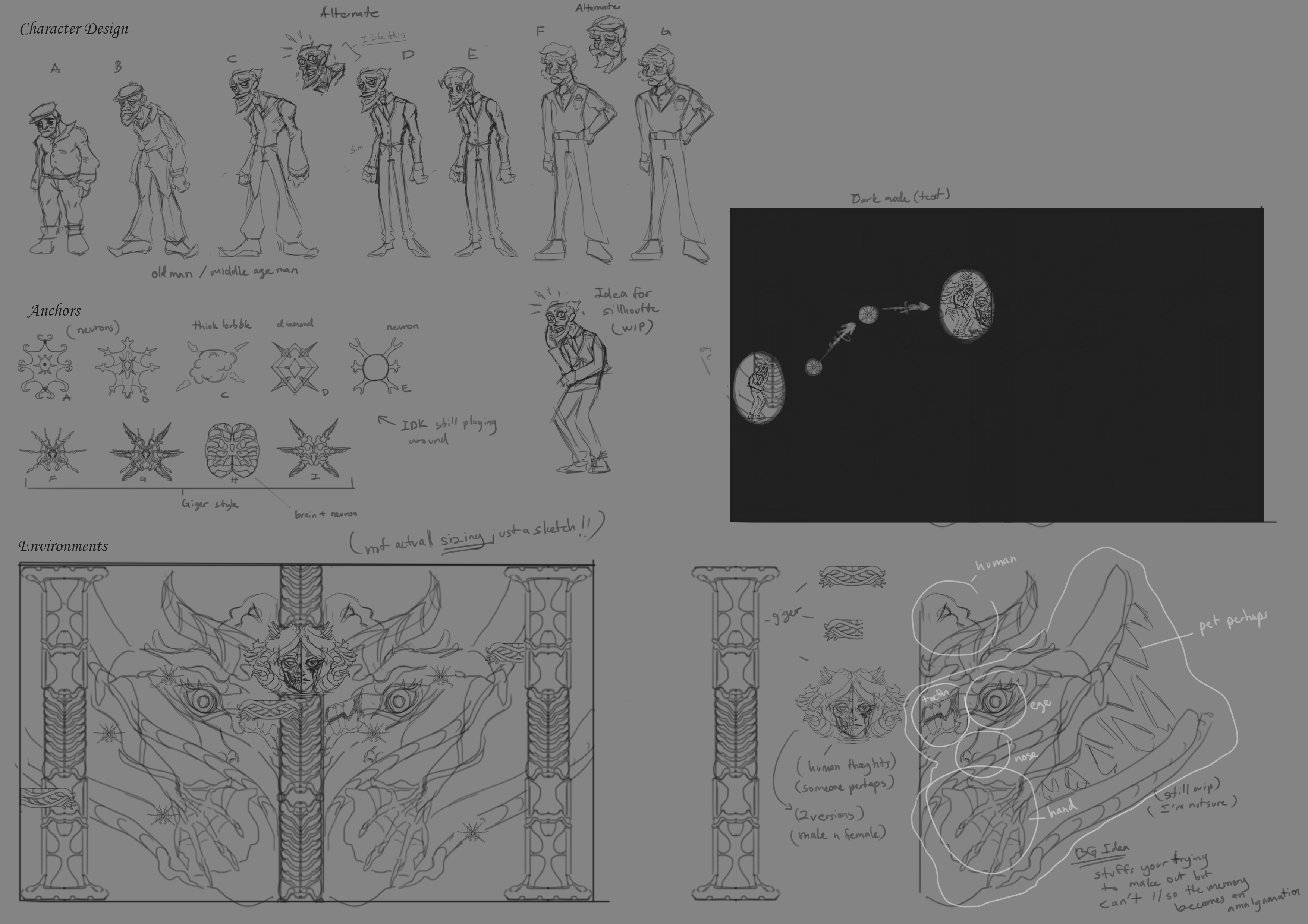
Background concept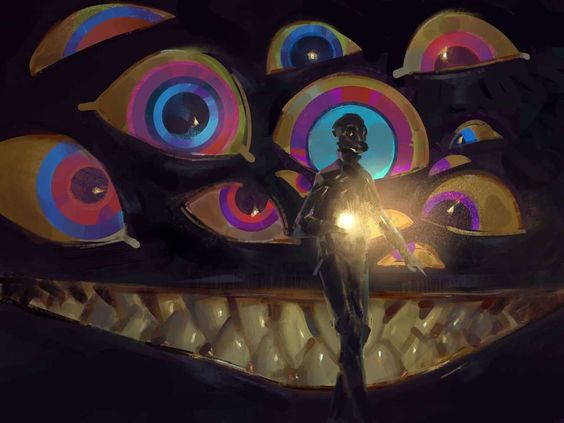
TECH PROGRESS: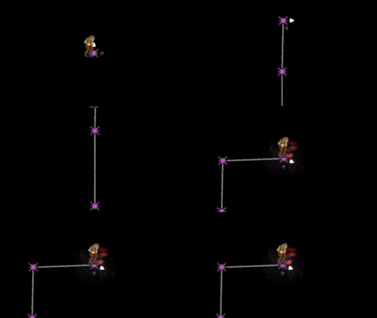
Files
Get Jim Jitters
Jim Jitters
While Jim goes through daily life events, explore his anxiety ridden mind.
| Status | Released |
| Authors | PassionPrimerGames, napmi |
| Genre | Puzzle |
| Tags | 2D, Creepy, Dark, Narrative, Story Rich, Unity |
Leave a comment
Log in with itch.io to leave a comment.